Graphic Design
Yale-NUS Conceptual Prospectus
The approach to the Yale-NUS prospectus aims to reflect the humanistic value and broad thinking ethos of liberal arts education. A creative storyline is conceptualized and applied throughout the print to inform viewers on the college’s extensive syllabus and programmes. Part of the print takes on the narrative of ‘A Day in the Life of A Yale-NUS Student’ and leads the reader through a journey from front cover to end.
Client: Yale-NUS College Singapore via Splash Productions (agency)
Experience in: Advertising, Book Layout, Print, Illustration
Brand Collaterals for F&B Establishment
Drawing inspirations from the versatility and changeability of tapas bar selections, this establishment incorporated an ever-changing set of colour scheme catered to unique campaigns and promotional collateral type. A minimal, straightforward approach for brand visuals is adopted to keep the product limelight—the food!—in focus.
Client: 63Celsius (restaurant), 63ESPRESSO (café)
Experience in: Advertising, Corporate Identity, Illustration, Photography
Rebranding Logo for Early Childhood Educational Centre
The vision of The Early Brain Academy is that every child born needs the enriched environment and opportunities early to develop a better brain for the future. Having undergone a total brand name and logo refresh, TEBA wanted a new look that encapsulates their vision. Taking the association of early childhood and key constituents of child development (parental care, environment), the building blocks are used as the main visual cues for the logo design.
Client: The Early Brain Academy
Experience in: Rebranding, Logo Design, (Process) Linocut Logo Print
eDM for Prudential Singapore’s Community Investment and KidSTART Partnership Programmes
A series of family-friendly illustrations are created for a monthly electronic direct mailer that aimed to inform subscribers and existing customers alike on volunteering opportunities that can help to educate the public and contribute to the society in meaningful ways. A cohesive set of human characters are illustrated for consistency and familiarity towards the programmes.
Client: Prudential Singapore
Experience in: Advertising, Digital Illustration, Layout Design
Rebranding Logo and Corporate Stationery for Stationery World
A refreshed brand logo and corporate stationery set is created for Stationery World in hopes of modernizing the long-established brand. The direct visual association with the word ‘world’ paired with the alignment of line structures on the logo aims to represent the mission of the brand and its nature of business.
Official merchandise such as the ubiquitous canvas totebag incorporated a more lighthearted approach.
Client: Stationery World
Experience in: Corporate Identity, Rebranding, Logo Design, Merchandise, Product Photography
Art Direction for studioBAB.com
A fashion project studio-Build-A-Bag (‘BAB’ in short) wanted to inject fun and creativity in everyone’s retail experience. The brand incorporated a customizable approach for their products from features such as name-stamping, decorative patches, bag straps—providing a range of modifications that their target audience can participate in. The branding hence reflected that idea and attitude with a modular approach starting from the logo design down to the lookbook of the products.
To view social media content creation, click here.
Client: studioBAB.com
Experience in: Art Direction, Branding, Photography, Project Coordination, Social Media Marketing, Merchandise, Web Design
Social Media Assets Building for foodpanda APAC
Some of the experiences working with foodpanda included curating social media assets for around 9 markets, ranging from Singapore to Myanmar and Bangalore, working on creatives for various programmatic ad sizes catering to platforms such as online news websites, blogs, mobile etc, and also adapting campaign hero key visuals to tactical lower funnel ads for go-to-market efforts.
Client: foodpanda APAC via Visual Inconsideration (agency)
Experience in: Social Media Content, Design Adaptation
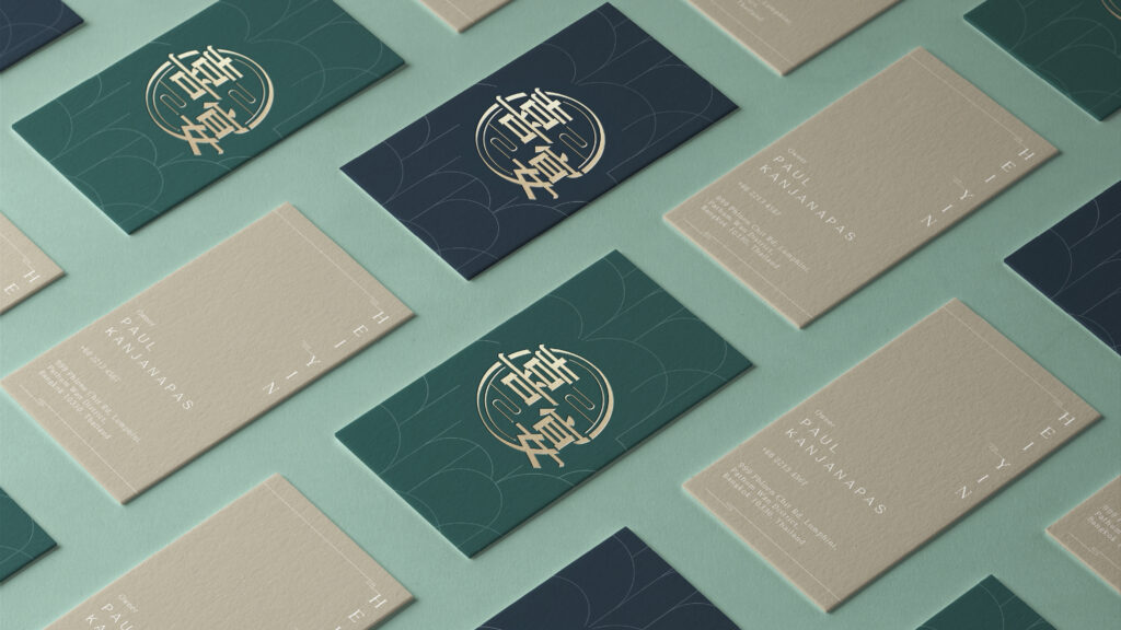
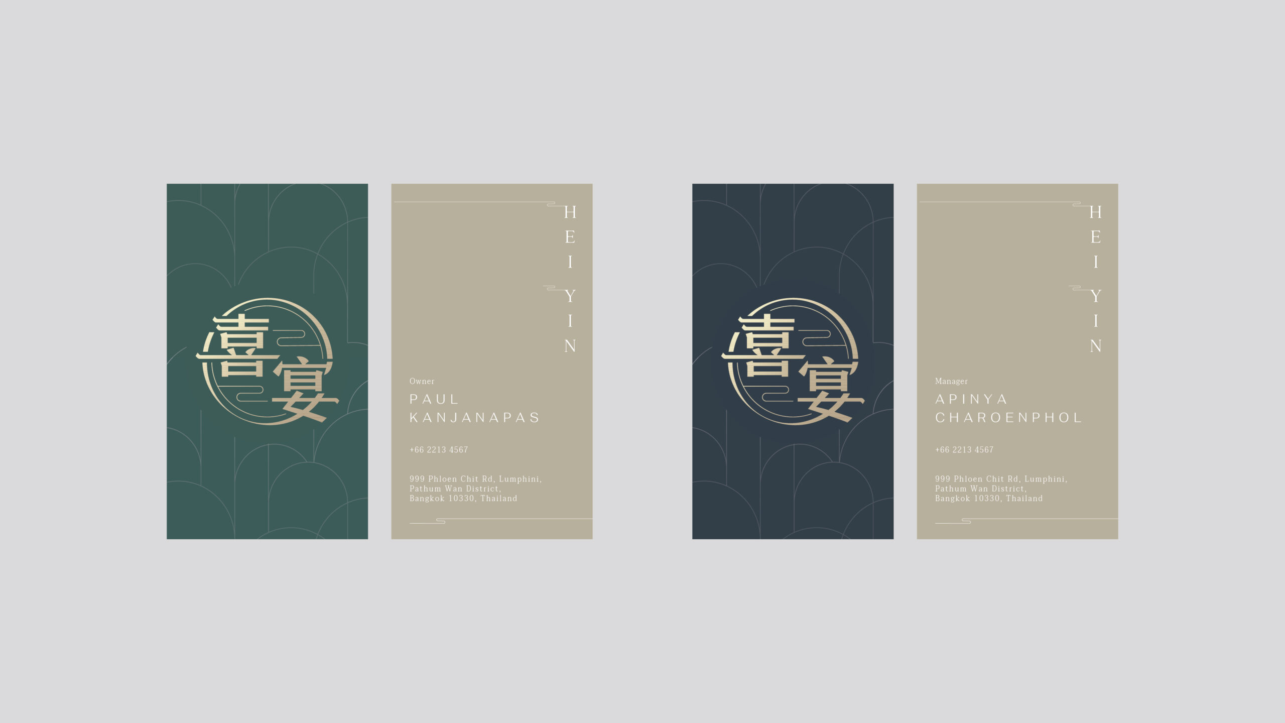
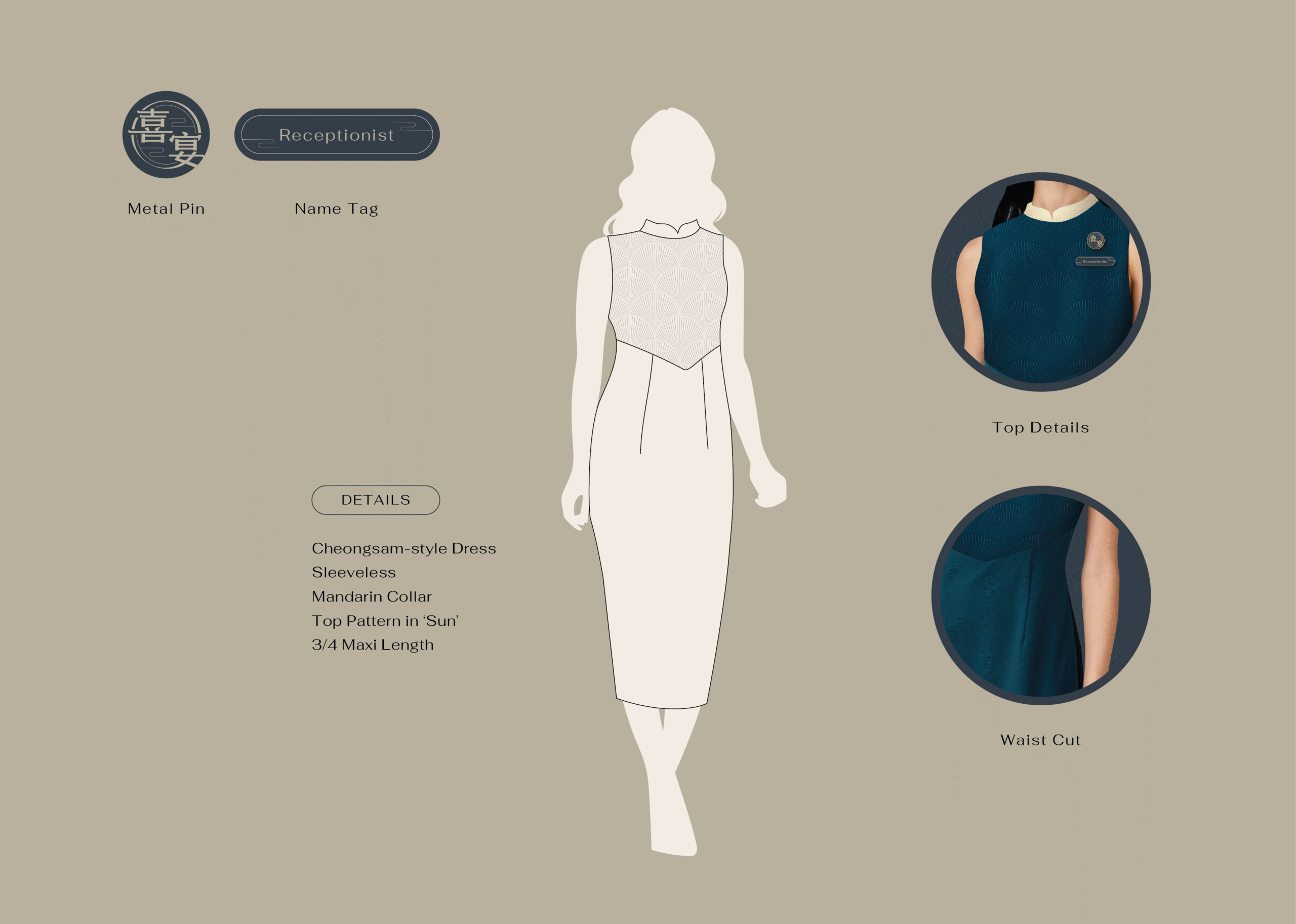
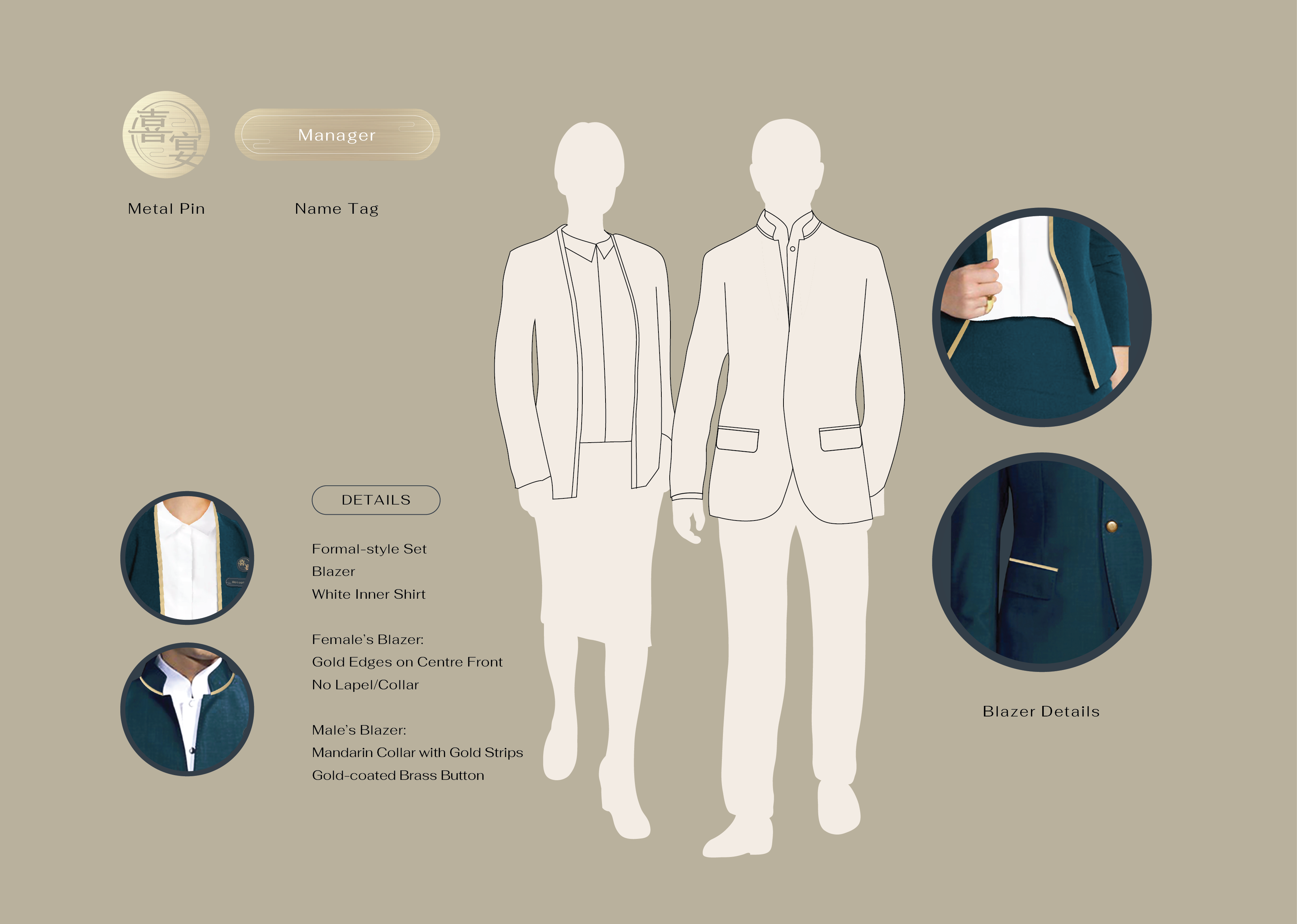
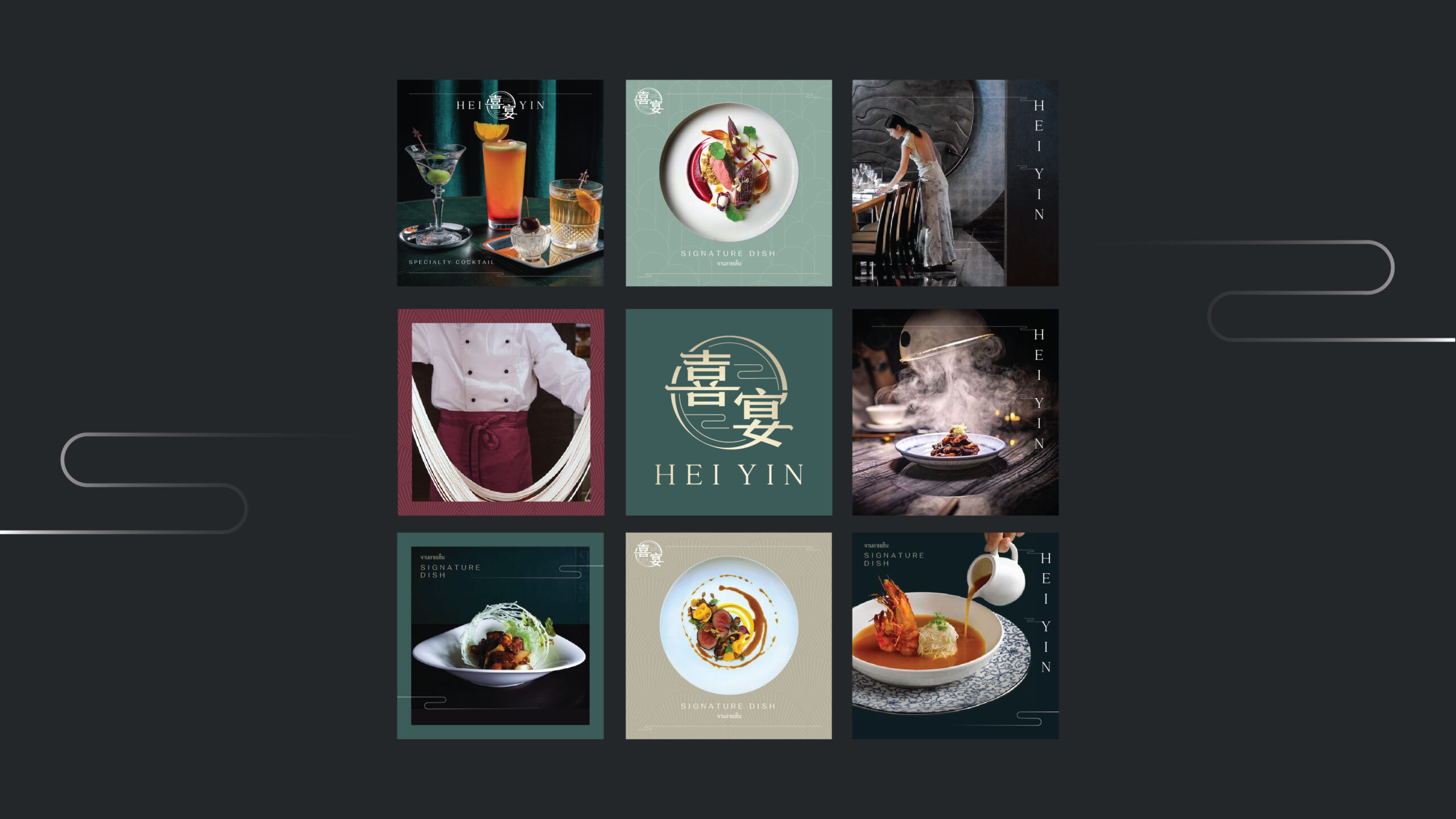
Brand Collaterals FA Prep
for Cantonese Restaurant
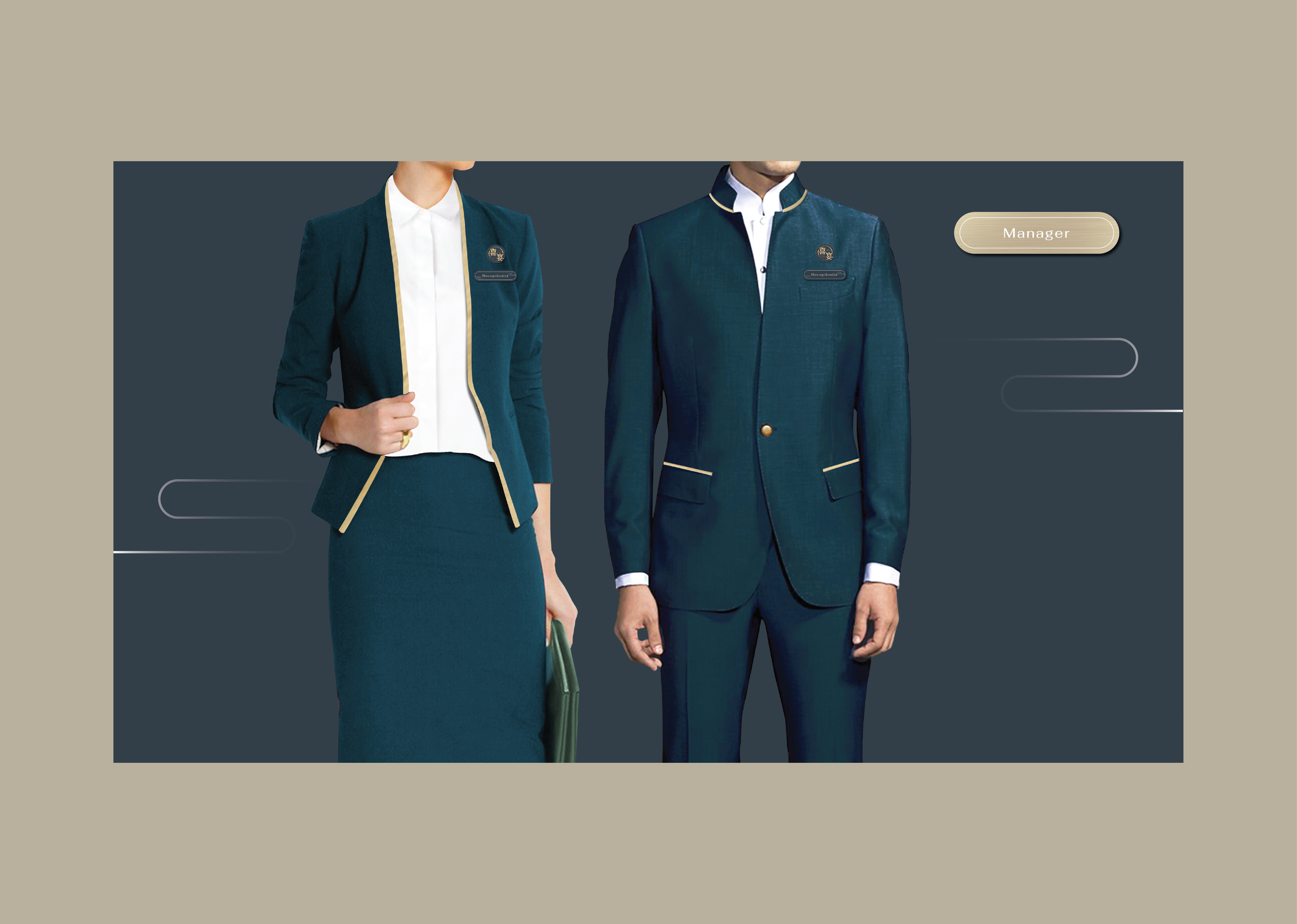
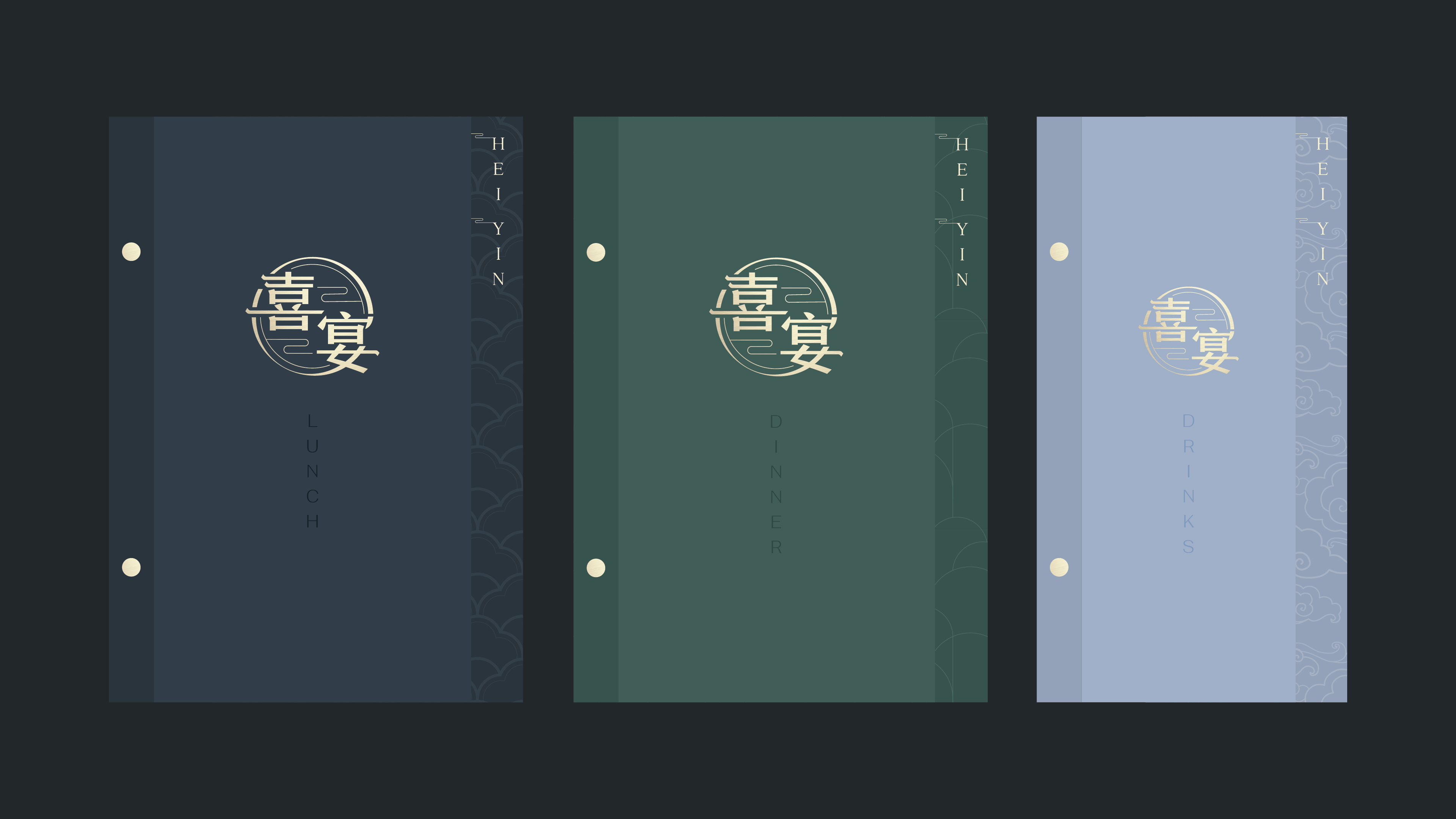
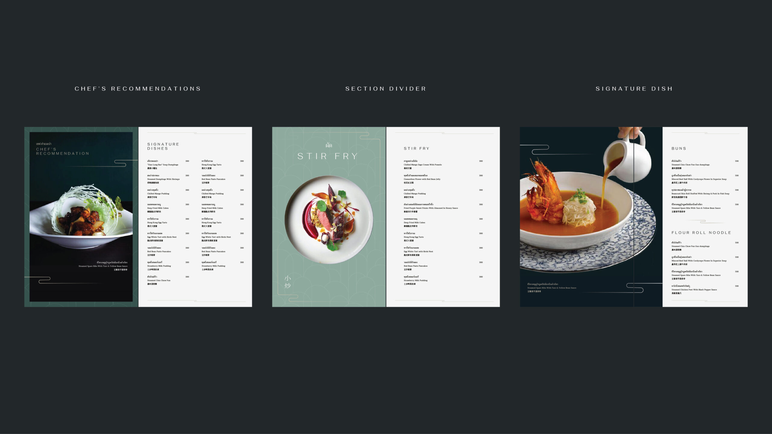
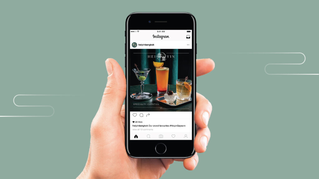
An extensive set of design mockups are created for this restaurant that serves modern Cantonese cuisine.
Client: HEI YIN Bangkok (Branding is done by another Graphic Designer)
Experience in: FA Production, Mockup Creation, Layout Design


